Chart (GTLS)
Chart is a great business. Its robust backlog growth shows it has a long tail of demand that will fuel sales for many quarters.― StockStory Analyst Team
1. News

2. Summary
Why We Like Chart
Installing the first bulk Co2 tank for McDonalds’s sodas, Chart (NYSE:GTLS) provides equipment to store and transport gasses.
- Annual revenue growth of 29.4% over the last five years was superb and indicates its market share increased during this cycle
- Earnings per share grew by 24.4% annually over the last five years and trumped its peers
- Sales pipeline is in good shape as its backlog averaged 22.5% growth over the past two years


We see a bright future for Chart. The valuation seems fair based on its quality, so this might be a prudent time to buy some shares.
Why Is Now The Time To Buy Chart?


At $206.79 per share, Chart trades at 15.9x forward P/E. Valuation is lower than most companies in the industrials space, and we believe Chart is attractively-priced for its quality.
Where you buy a stock impacts returns. Our analysis shows that business quality is a much bigger determinant of market outperformance over the long term compared to entry price, but getting a good deal on a stock certainly isn’t a bad thing.
3. Chart (GTLS) Research Report: Q4 CY2025 Update
Gas handling company Chart (NYSE:GTLS) fell short of the market’s revenue expectations in Q4 CY2025, with sales falling 2.5% year on year to $1.08 billion. Its non-GAAP profit of $2.51 per share was 16.7% below analysts’ consensus estimates.
Chart (GTLS) Q4 CY2025 Highlights:
- Revenue: $1.08 billion vs analyst estimates of $1.19 billion (2.5% year-on-year decline, 8.9% miss)
- Adjusted EPS: $2.51 vs analyst expectations of $3.01 (16.7% miss)
- Adjusted EBITDA: $238.8 million vs analyst estimates of $305 million (22.1% margin, 21.7% miss)
- Operating Margin: 9.9%, down from 17% in the same quarter last year
- Free Cash Flow Margin: 6.1%, down from 23.6% in the same quarter last year
- Backlog: $5.89 billion at quarter end, up 21.5% year on year
- Market Capitalization: $9.91 billion
Company Overview
Installing the first bulk Co2 tank for McDonalds’s sodas, Chart (NYSE:GTLS) provides equipment to store and transport gasses.
Chart, originally known as John Marston, was established as a manufacturer of bicycles and eventually made a transition to become a gas handling company. The company invested in research and development and later acquired various small- to mid-sized companies to facilitate its transition. Today, the company offers stationary and rotating equipment used to store and transport gasses.
Chart’s stationary equipment is designed to store gas at the right temperatures and pressures. For instance, these tanks store gas used in manufacturing processes such as steel production or semiconductor manufacturing. It also offers rotating equipment, such as pumps and compressors, which transport gasses from storage tanks to where they are needed. Its pumps move gasses through pipes or hoses by creating pressure while its compressors increase the pressure of gasses to make them easier to store or transport over long distances. It also offers maintenance and repair services which establishes a stream of recurring revenue.
The company sells its products through one-time purchases and long-term supply agreements, though the latter is more common. These supply agreements vary in duration and are typically up to 5 years. It incentivizes its customers to purchase larger quantities by offering volume discounts thereby reducing the per-unit cost of the equipment. Additionally, Chart offers leasing options ranging from short-term rentals responding to seasonal demand to long-term rentals lasting up to 10 years.
Chart continues to focus on improving its existing products and strengthening its international presence. Specifically, its $4.4 billion acquisition of Howden in 2023 did just that.
4. Gas and Liquid Handling
Gas and liquid handling companies possess the technical know-how and specialized equipment to handle valuable (and sometimes dangerous) substances. Lately, water conservation and carbon capture–which requires hydrogen and other gasses as well as specialized infrastructure–have been trending up, creating new demand for products such as filters, pumps, and valves. On the other hand, gas and liquid handling companies are at the whim of economic cycles. Consumer spending and interest rates, for example, can greatly impact the industrial production that drives demand for these companies’ offerings.
Competitors offering similar products include Snap-On (NYSE:SNA), IDEX (NYSE:IEX), and Graco (NYSE:GGG).
5. Revenue Growth
A company’s long-term performance is an indicator of its overall quality. Any business can experience short-term success, but top-performing ones enjoy sustained growth for years. Thankfully, Chart’s 29.4% annualized revenue growth over the last five years was incredible. Its growth surpassed the average industrials company and shows its offerings resonate with customers, a great starting point for our analysis.
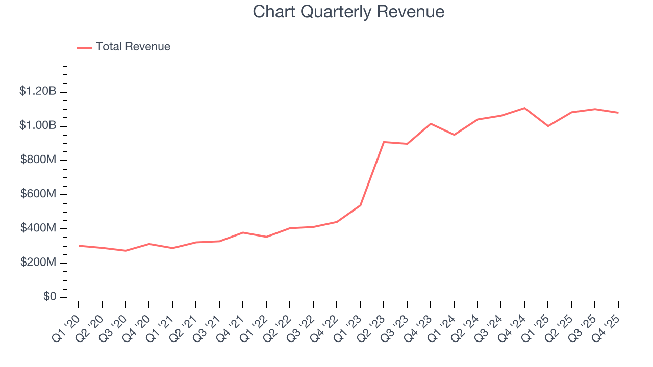
We at StockStory place the most emphasis on long-term growth, but within industrials, a half-decade historical view may miss cycles, industry trends, or a company capitalizing on catalysts such as a new contract win or a successful product line. Chart’s annualized revenue growth of 12.7% over the last two years is below its five-year trend, but we still think the results suggest healthy demand. 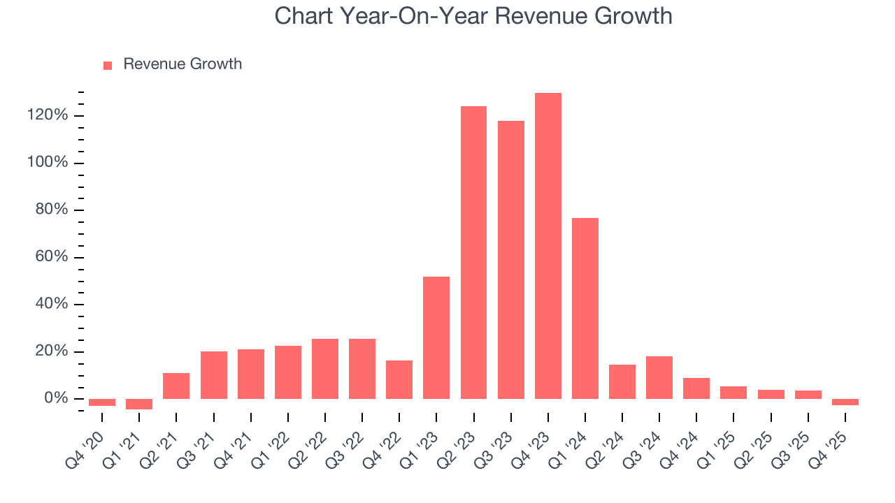
We can dig further into the company’s revenue dynamics by analyzing its backlog, or the value of its outstanding orders that have not yet been executed or delivered. Chart’s backlog reached $5.89 billion in the latest quarter and averaged 22.5% year-on-year growth over the last two years. Because this number is better than its revenue growth, we can see the company accumulated more orders than it could fulfill and deferred revenue to the future. This could imply elevated demand for Chart’s products and services but raises concerns about capacity constraints. 
This quarter, Chart missed Wall Street’s estimates and reported a rather uninspiring 2.5% year-on-year revenue decline, generating $1.08 billion of revenue.
Looking ahead, sell-side analysts expect revenue to grow 10.7% over the next 12 months, a slight deceleration versus the last two years. Despite the slowdown, this projection is noteworthy and implies the market is forecasting success for its products and services.
6. Gross Margin & Pricing Power
Chart’s unit economics are better than the typical industrials business, signaling its products are somewhat differentiated through quality or brand.As you can see below, it averaged a decent 31.4% gross margin over the last five years. That means for every $100 in revenue, roughly $31.36 was left to spend on selling, marketing, R&D, and general administrative overhead. 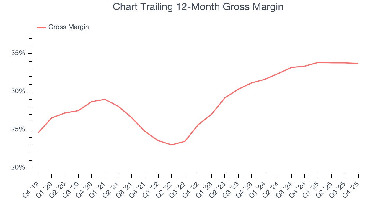
This quarter, Chart’s gross profit margin was 33.3%, in line with the same quarter last year. Zooming out, the company’s full-year margin has remained steady over the past 12 months, suggesting its input costs (such as raw materials and manufacturing expenses) have been stable and it isn’t under pressure to lower prices.
7. Operating Margin
Chart has managed its cost base well over the last five years. It demonstrated solid profitability for an industrials business, producing an average operating margin of 11%.
Looking at the trend in its profitability, Chart’s operating margin rose by 1.3 percentage points over the last five years, as its sales growth gave it operating leverage.
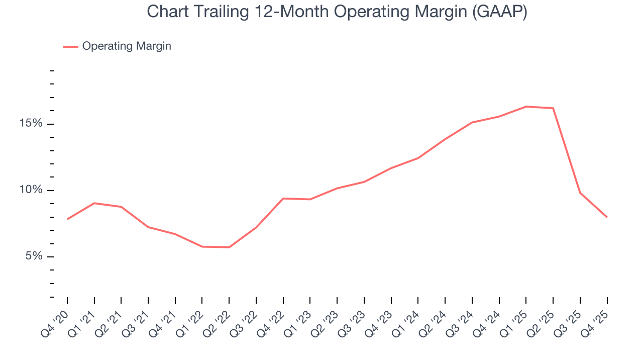
In Q4, Chart generated an operating margin profit margin of 9.9%, down 7.1 percentage points year on year. Since Chart’s operating margin decreased more than its gross margin, we can assume it was less efficient because expenses such as marketing, R&D, and administrative overhead increased.
8. Earnings Per Share
Revenue trends explain a company’s historical growth, but the long-term change in earnings per share (EPS) points to the profitability of that growth – for example, a company could inflate its sales through excessive spending on advertising and promotions.
Chart’s EPS grew at an astounding 24.4% compounded annual growth rate over the last five years. Despite its operating margin improvement during that time, this performance was lower than its 29.4% annualized revenue growth, telling us that non-fundamental factors such as interest and taxes affected its ultimate earnings.
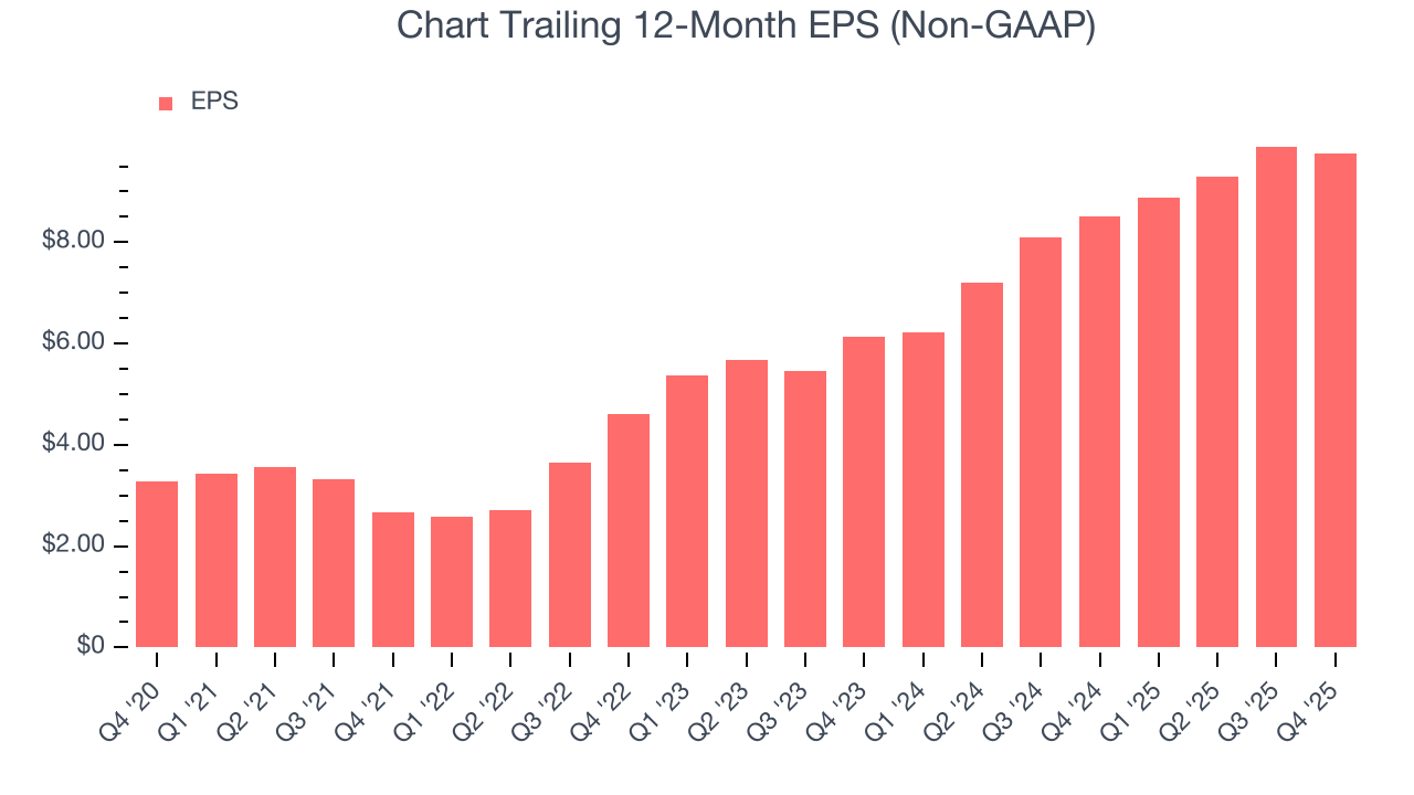
We can take a deeper look into Chart’s earnings to better understand the drivers of its performance. A five-year view shows Chart has diluted its shareholders, growing its share count by 19%. This dilution overshadowed its increased operational efficiency and has led to lower per share earnings. Taxes and interest expenses can also affect EPS but don’t tell us as much about a company’s fundamentals. 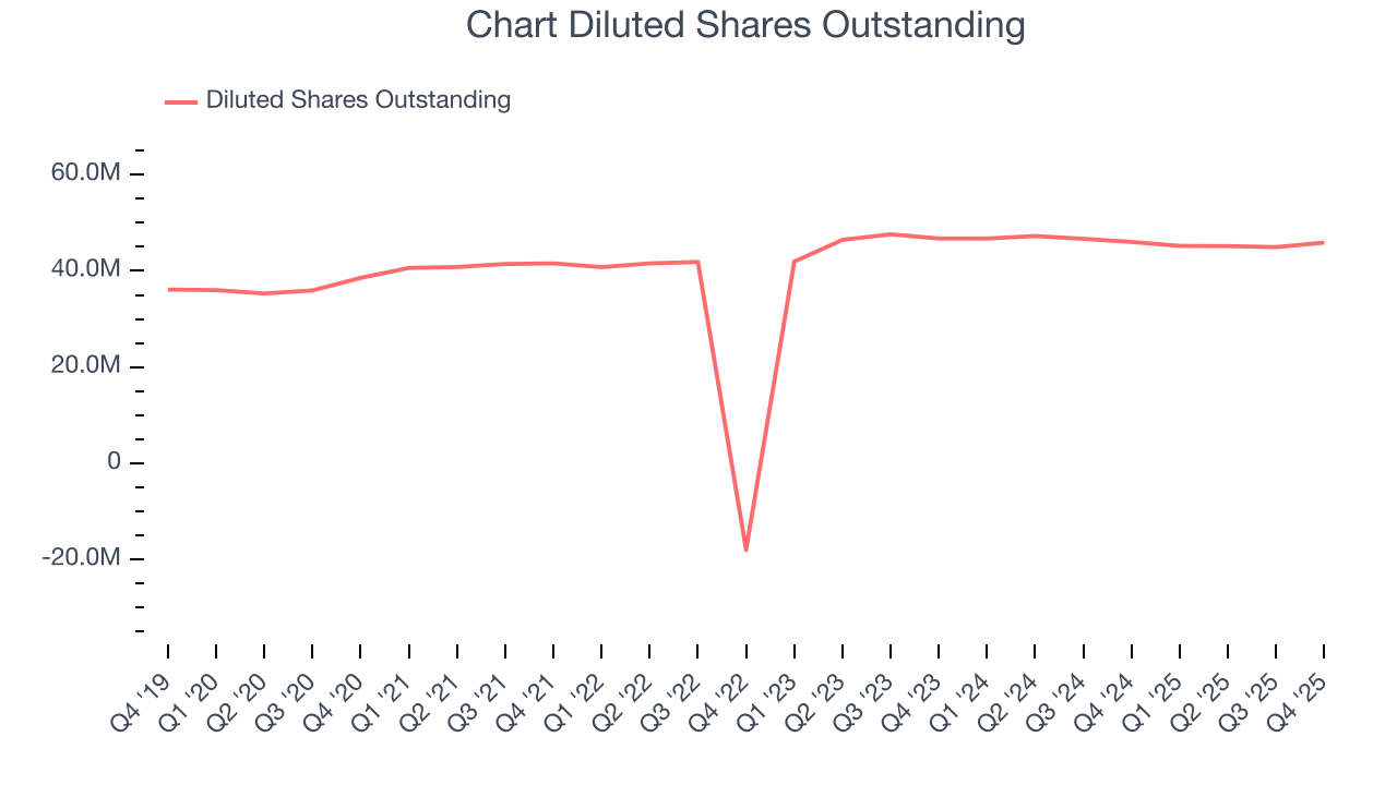
Like with revenue, we analyze EPS over a shorter period to see if we are missing a change in the business.
For Chart, its two-year annual EPS growth of 26.1% was higher than its five-year trend. We love it when earnings growth accelerates, especially when it accelerates off an already high base.
In Q4, Chart reported adjusted EPS of $2.51, down from $2.66 in the same quarter last year. This print missed analysts’ estimates, but we care more about long-term adjusted EPS growth than short-term movements. Over the next 12 months, Wall Street expects Chart’s full-year EPS of $9.74 to grow 33.3%.
9. Cash Is King
If you’ve followed StockStory for a while, you know we emphasize free cash flow. Why, you ask? We believe that in the end, cash is king, and you can’t use accounting profits to pay the bills.
Chart has shown weak cash profitability over the last five years, giving the company limited opportunities to return capital to shareholders. Its free cash flow margin averaged 3.7%, subpar for an industrials business. The divergence from its good operating margin stems from its capital-intensive business model, which requires Chart to make large cash investments in working capital and capital expenditures.
Taking a step back, an encouraging sign is that Chart’s margin expanded by 10.4 percentage points during that time. The company’s improvement shows it’s heading in the right direction, and we can see it became a less capital-intensive business because its free cash flow profitability rose more than its operating profitability.
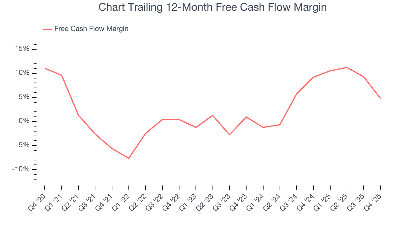
Chart’s free cash flow clocked in at $66.2 million in Q4, equivalent to a 6.1% margin. The company’s cash profitability regressed as it was 17.4 percentage points lower than in the same quarter last year, but it’s still above its five-year average. We wouldn’t read too much into this quarter’s decline because capital expenditures can be seasonal and companies often stockpile inventory in anticipation of higher demand, causing short-term swings. Long-term trends trump temporary fluctuations.
10. Return on Invested Capital (ROIC)
EPS and free cash flow tell us whether a company was profitable while growing its revenue. But was it capital-efficient? Enter ROIC, a metric showing how much operating profit a company generates relative to the money it has raised (debt and equity).
Although Chart has shown solid fundamentals lately, it historically did a mediocre job investing in profitable growth initiatives. Its five-year average ROIC was 5.5%, somewhat low compared to the best industrials companies that consistently pump out 20%+.
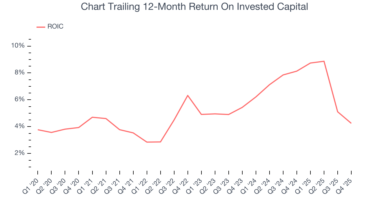
We like to invest in businesses with high returns, but the trend in a company’s ROIC is what often surprises the market and moves the stock price. Fortunately, Chart’s ROIC averaged 1.3 percentage point increases each year over the last few years. its rising ROIC is a good sign and could suggest its competitive advantage or profitable growth opportunities are expanding.
11. Balance Sheet Assessment
Chart reported $366 million of cash and $3.57 billion of debt on its balance sheet in the most recent quarter. As investors in high-quality companies, we primarily focus on two things: 1) that a company’s debt level isn’t too high and 2) that its interest payments are not excessively burdening the business.
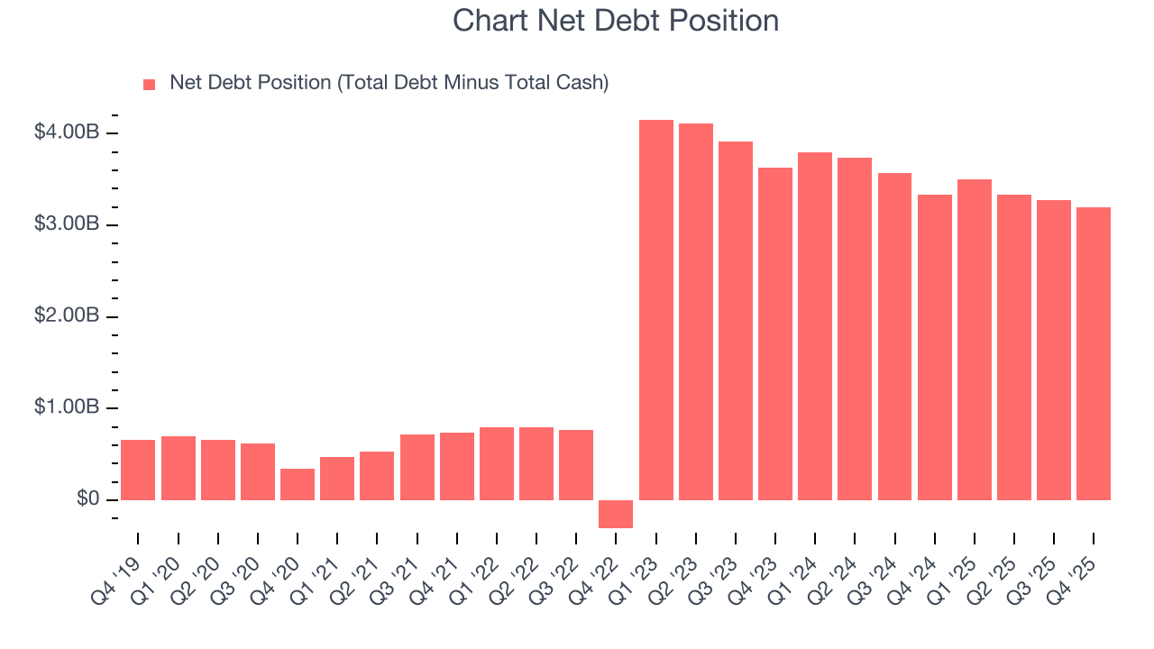
With $1.01 billion of EBITDA over the last 12 months, we view Chart’s 3.2× net-debt-to-EBITDA ratio as safe. We also see its $307.8 million of annual interest expenses as appropriate. The company’s profits give it plenty of breathing room, allowing it to continue investing in growth initiatives.
12. Key Takeaways from Chart’s Q4 Results
We struggled to find many positives in these results. Its revenue missed and its EBITDA fell short of Wall Street’s estimates. Overall, this was a softer quarter. The stock remained flat at $207.29 immediately following the results.
13. Is Now The Time To Buy Chart?
Updated: March 15, 2026 at 10:11 PM EDT
Are you wondering whether to buy Chart or pass? We urge investors to not only consider the latest earnings results but also longer-term business quality and valuation as well.
There are several reasons why we think Chart is a great business. For starters, its revenue growth was exceptional over the last five years. And while its relatively low ROIC suggests management has struggled to find compelling investment opportunities, its backlog growth has been marvelous. Additionally, Chart’s rising cash profitability gives it more optionality.
Chart’s P/E ratio based on the next 12 months is 15.9x. Looking at the industrials landscape today, Chart’s fundamentals really stand out, and we like it at this price.
Wall Street analysts have a consensus one-year price target of $205.67 on the company (compared to the current share price of $206.79).